Right now you can generate a logo, a colour palette and a full brand guideline in about four minutes. Type a prompt, pick one of twelve options, done. Half the "rebrands" I see on my feed this year started life inside an image model.
So when Apple Music dropped its new identity on October 21, I'll admit it stopped me mid-scroll. Not because it's flashy (it is), but because of how it was made. Apple didn't draw a logo. They played music into a bath of oil and filmed what the sound did to it.
As someone who builds brands for a living, I think it's one of the most meaningful identity projects of the year. Here's what changed, how they pulled it off, and why I think the people hating on it right now will come around.
What actually changed
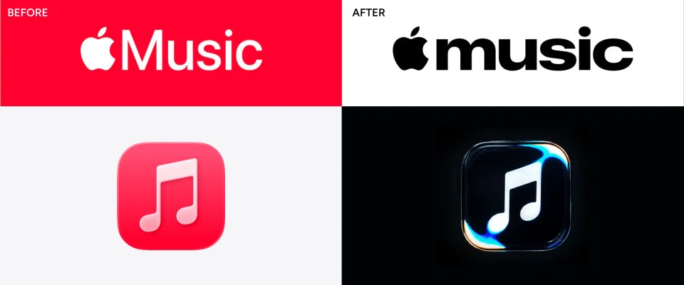
This is Apple Music's first proper rebrand since it launched in 2015, and it touches four things:
- The wordmark. "Music" with a capital M in Apple's thin system font is gone. It's now a bold, lowercase "music" in a custom, heavier cut of SF Pro, set tight. It reads less like a settings label and more like a music magazine masthead.
- The app icon. The red square with white notes is now black on white (white on black in dark mode). The note itself is subtly reshaped too.
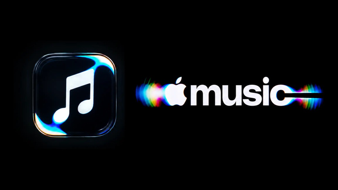
- A motion logo. A rippling, glassy, iridescent version of the note and wordmark that will open Apple Music videos and concert footage.
- A sonic logo. A short original composition by Fred again.. and NEST Acoustics. Same piece of music that shaped the visuals (more on that below).
Inside the app, red accents have turned blue, widgets have gone black, and Library icons are now monochrome.
The rollout was staged, not dropped all at once:
| Date | What happened |
|---|---|
| Oct 21, 2026 | Apple officially unveils the "Made by Sound" identity with a behind-the-scenes film |
| Oct 13, 2026 | iOS 27.2 beta 4 swaps the red icon for black and white |
| Oct 5, 2026 | The new wordmark shows up in iOS 27.2 beta 3 |
| Sep 21, 2026 | The wordmark debuts at Apple Music Hall, Apple's new 600-capacity venue in London's Battersea Power Station |
That soft launch at a real venue, weeks before it hit anyone's phone, is a smart move in itself. People met the new mark in a physical space before they met it on their home screen.
How they made it (no CGI, no prompts)
The brief, in Apple's own words from the film: "we wanted sound to create the visuals." Here's roughly how that played out:
- Music first. Fred again.. and NEST Acoustics wrote a short composition, then broke it down into individual notes.
- Sound becomes movement. Each note was played through a transducer, a device that turns an audio signal into physical vibration, sitting in a shallow bath of mineral oil.
- The logo goes under the liquid. Acrylic versions of the note and the wordmark were placed in the tank, so the rippling oil bent and distorted them in real time.
- Everything shot in camera. Light refracting through the moving oil threw off flashes of colour, almost like light on an oil slick. That footage is the logo.
Why mineral oil and not water? It's thicker, so the ripples move slower and look more like liquid glass. And the constraints shaped the music too: too many notes, or notes pitched too high, churned the oil so much the logo became unreadable. So the visual limits literally decided how the sonic logo was arranged.
The team behind it: Apple's agency TBWA\Media Arts Lab, director Joe Jackson, Optical Arts on production, and type foundry Plau on the lettering. Reports say it took months of experimenting.
The result isn't an illustration of music. It's a physical record of what music does.
Why I love it: the sound is the brand
This is the part most of the hot takes are missing. The composition didn't just shape the logo. It is the logo, the audio version of it. The same few notes you see rippling in the oil are what you'll hear when an Apple Music video or concert stream starts.
Think about Netflix. You know it's Netflix from the "ta-dum" alone. You don't need to see the red N animate. That sound has been played before so many shows that it lives in your head rent-free, and that's brand recall you can't buy with a media budget.
Apple Music is setting itself up for the same thing. Every concert film, every Apple Music Hall livestream, every original doc will open with this sting. Give it a year and people will recognise Apple Music with their eyes closed. For a music service, that's exactly where your brand should live.
And because sound and visuals come from one single source, they'll always feel related. They're not two separate assets a committee matched later. They're the same thing in two formats.
Built with artists, and built to fit
Two more things I think Apple nailed.
The people who make the music helped make the brand. Bringing in Fred again.. isn't a celebrity cameo. A working musician wrote the thing the logo is made of. For a platform that exists because of artists, that puts the brand closer to the people it serves. It's the difference between saying "we love artists" in a press release and actually handing them the pen.
It finally looks like it belongs to Apple's current world. The rippling, glassy motion slots straight into Liquid Glass, the translucent design language Apple rolled out with iOS 26. The old thin wordmark looked a bit lost next to everything else. This one feels like part of the same family, and it follows the playbook Apple used for the Apple TV rebrand last year: real glass shot in camera, a sonic logo by Finneas, a custom cut of the San Francisco typeface. That project went on to win the Design Grand Prix at Cannes Lions 2026, so this isn't a one-off experiment. It's a system.
Remember when Liquid Glass first dropped? Half the internet said it looked like Windows Vista. Fast forward, and plenty of other apps and brands have started borrowing the look. I think this rebrand will follow the same curve.
About the black and white icon (and the backlash)
Let's address it. People are not happy. The new icon has been called boring, generic and "Apple Music, but emo." One post on X called it potentially the worst iOS change in a decade.
View this post on X
I get the reaction, but I think dropping the red was the right call. A few reasons:
- Red wasn't as sacred as it feels. The red icon only arrived in 2020. Before that it was a pink-to-blue gradient, and before that orange. The note is the real constant, and the note stayed.
- The colour moved, it didn't disappear. The new identity is full of colour. It just lives in the motion logo, the films and the artist imagery now, where it can actually move and breathe.
- A neutral icon lets the music be the colour. Album art, artist photos, concert footage. On a music platform, that's the stuff that should be loud. The frame doesn't need to compete with the picture.
Almost every big rebrand gets this reaction in week one. People don't dislike the new thing, they miss the familiar thing. Six months from now the red icon will look dated, and nobody will remember being upset.
The real lesson: meaning is the new moat
Apple could have generated this. A prompt for "liquid glass music note, iridescent, rippling" would get you something that looks 80% the same in under a minute. They spent months with a tank of oil instead.
That's the point. When anyone can make something that looks good, looking good stops being a differentiator. What can't be generated is the story: a musician wrote a piece, the piece moved the liquid, the liquid became the logo. That origin is the brand. It's the reason design press is writing about it, and it's the reason I'm writing this.
You don't need Apple's budget to apply this. A few ways smaller brands can borrow the thinking:
- Make your mark from something real. A bakery's flour, a roaster's smoke, a tailor's fabric, a mechanic's actual tools. Build the visual from your own process, not a mood board.
- Shoot it, don't just render it. Real textures, real light, a real camera. Even a phone and a well-lit table beats another AI gradient.
- Show how you made it. Apple's best answer to the backlash was the behind-the-scenes film. A 30-second "how we made this" reel gives people a reason to care about something new.
- Use AI for the busywork, not the idea. Resizing, exports, variations, all fine. The core idea should come from a human who knows the business.
In a feed full of things that took four minutes to make, the thing that clearly took four months is the one people stop for.
Final note
Is the icon going to win any popularity contests this week? No. Is this one of the most thoughtful identity projects a big tech brand has shipped in years? I think so. Apple didn't design a logo for music. They let the music design it. Give it six months, and give that sound a few hundred plays, and I'm betting we'll all hear it before we see it.