- Branding
Branding for Honey's Auto Detailing
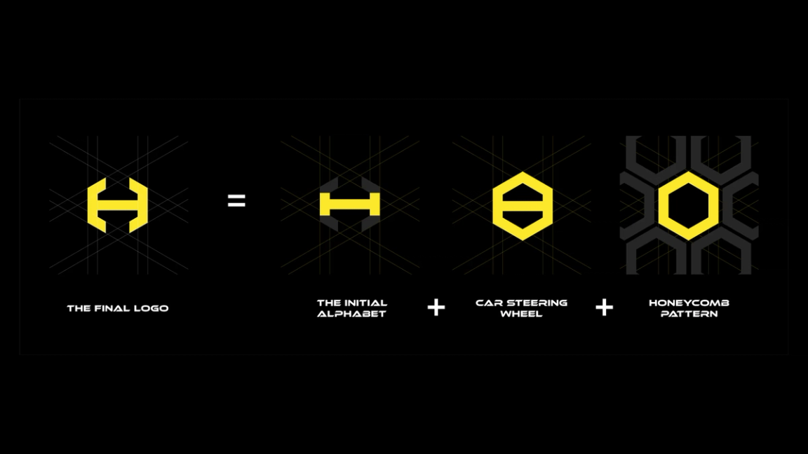
After a change in ownership, Honey's Auto Detailing needed a fresh, modern identity. We designed a new logo that blends the letter H, a steering wheel and a honeycomb.
- Client
- Honey's Auto Detailing
- Year
- 2024
- Industry
- Automotive
- Live site
- Visit site (opens in a new tab)
What the client needed
Honey's Auto Detailing had a new owner and an outdated logo. The new owner wanted a fresh, contemporary look that matched where they were taking the business. The goals:
- Refresh the brand identity: a modern logo that reflects the brand's commitment to quality and the new owner's vision.
- Build recognition: a unique, memorable mark with elements from the automotive world, so the brand is instantly recognisable.
- Appeal to the right customers: position Honey's as a premium, detail-oriented service for car owners who want high-quality care.
- Work everywhere: a logo that adapts to everything from digital assets to physical signage, for a consistent brand across every touchpoint.
What we brewed
We designed a sleek, modern logo that combines three elements: the initial letter H, a car steering wheel and a honeycomb structure. Together they make a distinctive, memorable mark that nods to the Honey's name and the automotive industry at once.
Set in bold yellow on black, the new identity modernises the brand, reinforces its focus on quality and attention to detail, and works across digital and physical touchpoints.
Fresh from the pot