- Branding
- Web Design
Branding, Collateral and Website for Vistara Search
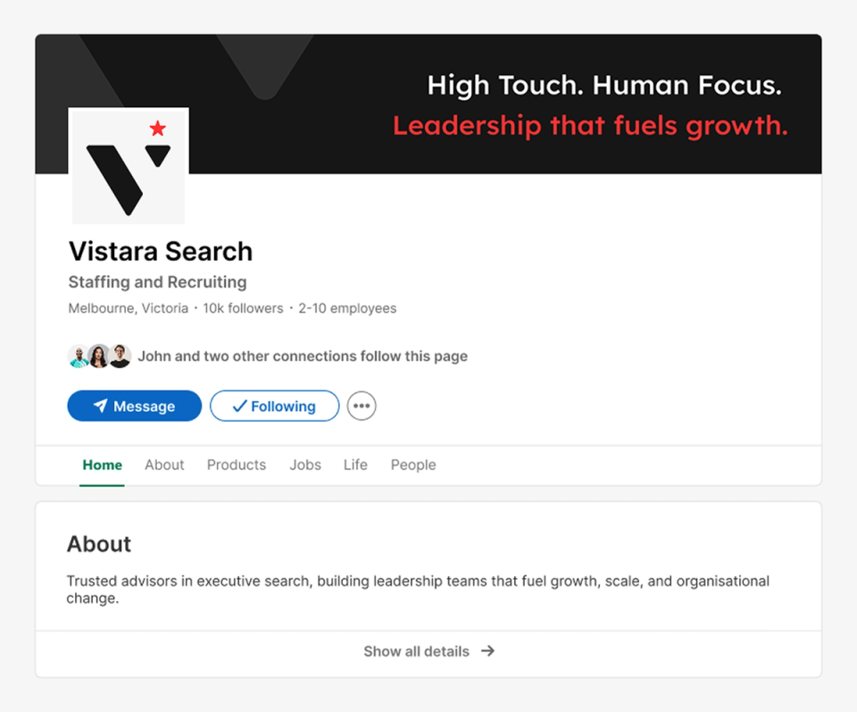
Vistara Search is a Melbourne-based executive search firm placing senior commercial leaders into high-growth technology and consumer businesses. We built its brand from the ground up, from the star logomark and colour system to deck templates, stationery, LinkedIn presence and a website that brings it all together.
- Client
- Vistara Search
- Year
- 2026
- Live site
- Visit site (opens in a new tab)

What the client needed
Executive search is a trust business. Founder Priyanka Shahani Haribhai set out to redefine the search experience with an approach that is high touch, human focused and outcome driven. The brand needed to say that before a single conversation took place.
Vistara needed an identity that felt premium enough for boardrooms, investors and CEOs, yet modern and warm enough to reflect its people-first, inclusive way of working. It also needed a consistent toolkit for every touchpoint, from a candidate's first visit to the website to a client's final update on a search.
- A logomark that captures people, leadership and excellence in one simple form
- A modern, inclusive palette that moves away from traditional corporate navy and gold
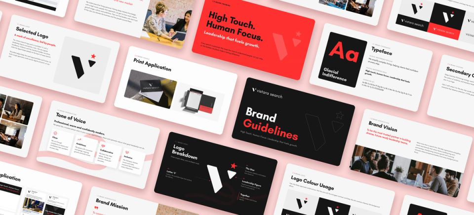
- Brand guidelines covering logo use, colour, typography, tone of voice and photography
- Search and pitch deck templates for winning new mandates
- Client update deck templates for reporting progress with clarity and data
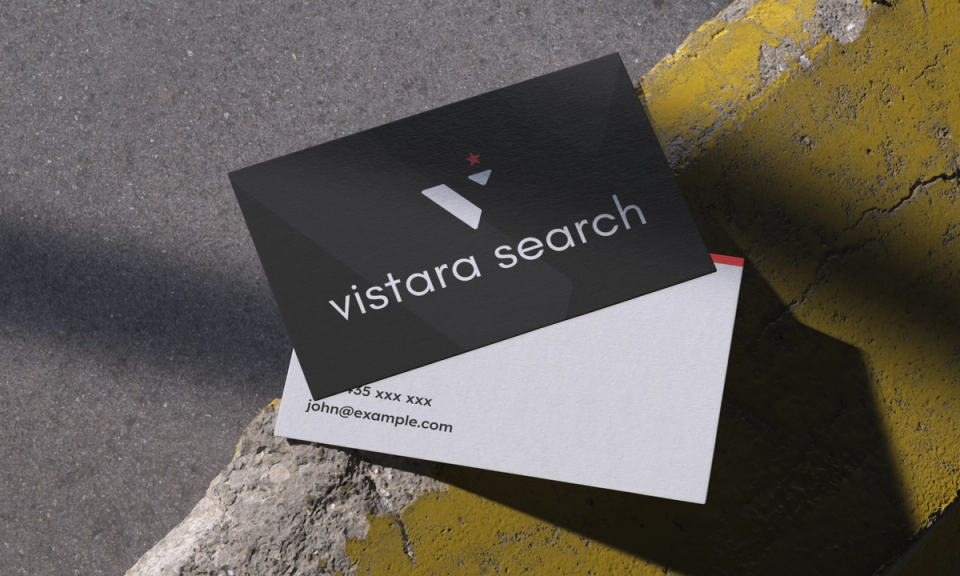
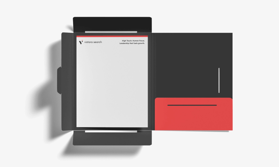
- Stationery including letterheads, business cards and presentation folders
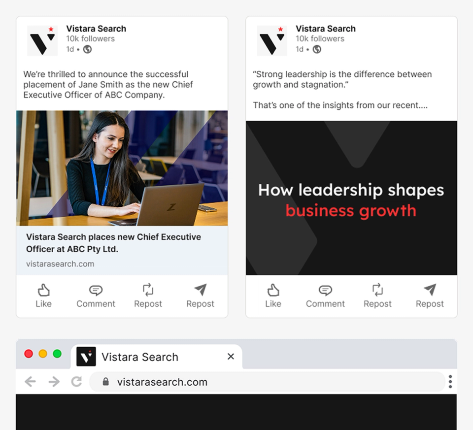
- A LinkedIn banner and post templates built around the line "High Touch. Human Focus."
- A website that positions Vistara with clients and candidates and brings the brand to life online
What we brewed
- We started with positioning, not visuals. Executive search is a crowded field where most firms look and sound alike, so Vistara had to stand for something specific: a search partner that is high touch, human focused and outcome driven. Every design decision had to prove that before a client or candidate ever spoke to Priyanka.
- We turned that promise into one line, "High Touch. Human Focus. Leadership that fuels growth.", and used it as the test for everything that followed. The logomark puts a person at the heart of the V, crowned by a star for the leaders Vistara places. The palette is black and a warm carmine, so the brand feels premium in a boardroom and approachable to a candidate.
- Vistara talks to two audiences at once: founders, boards and investors hiring senior commercial leaders, and the ambitious leaders weighing their next move. The website leads with the promise "Commercial leaders for high growth businesses" and gives each audience a clear path, while LinkedIn carries the same voice into the feeds where both groups already are.
- Search is won and kept on trust, so we designed for the whole client journey, not just the first impression. Pitch decks help win new mandates, client update decks report progress with clarity and data, and the guidelines and stationery keep every touchpoint consistent as the firm grows.
Fresh from the pot
I engaged Nimit and the Spresso team to support me with developing my brand and marketing material - from my logo through to my pitch deck, client update decks and my website. I have genuinely enjoyed the experience and he captured and executed on the brief very well. He is also accessible and collaborative, and will work with you to improve and iterate the materials until you are happy, which I value a lot. I would highly recommend working with Nimit!
